SHOPS Plus analysis reveals hidden patterns of private sector use
A recent SHOPS Plus analysis using small area estimation and geospatial mapping reveals more detailed patterns of private sector use that are hidden when looking at data in the aggregate. Previous SHOPS Plus analyses explored how the use of the public and private sectors for family planning and child health vary by key demographics such as age, marital status, urban/rural residence, wealth quintile, or income. The recent analysis uses a different approach, producing granular level results that are useful for advocacy and planning.
Small area estimation is an analytical approach to look at how the value of different parameters, such as modern contraceptive use or accessing services from the private sector, vary over a small geographic area. Using this approach, SHOPS Plus developed a series of heat maps—visualizations that use color to show differences in indicator values—for Kenya, Nepal, Uganda, Tanzania, and Guinea. The heat maps explore how contraceptive use and use of the public and private sectors vary across a country.
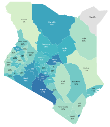
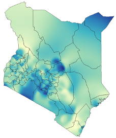
For example, the maps of Kenya, below, show the same information: the percent of women getting their family planning from a private sector source. The map on the left shows these data aggregated to the county level, while the map on the right shows small area estimation. According to Michelle Weinberger, the SHOPS Plus modeling and segmentation advisor who led this work, “There’s a lot that can be gained from looking at private sector use at the county level. However, there is a lot of variation and pockets of private sector use that are missed when data are aggregated at the county level. Additionally, you can see the degree to which administrative boundaries are arbitrary lines that patterns naturally continue across.”
Two views of Kenya: Percent of users getting their FP method from the private sector
 |
 |
 |
Source: DHS 2014
Maps for advocacy and planning
Maps can provide both relative views (the share of women using modern contraception) and absolute views (the number of women using modern contraception). Both are useful for different advocacy and planning needs. Maps also overlay useful contextual information such as the location of cities, towns, roadways, and health facilities. The project worked in partnership with teams in five countries to develop maps to inform its work. Below are examples of heat maps generated for Nepal.
Nepal modern contraceptive use
 |
Modern contraceptive prevalence (mCPR)  Nepal.png)
|
 |
Number of modern method users 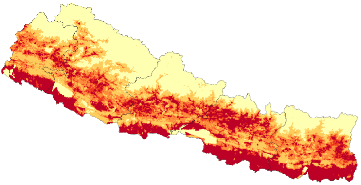
|
Sources: DHS 2016, WorldPop
SHOPS Plus uses heat maps and other types of data visualization tools to clearly present data, enabling discussions on market opportunities and program interventions based on what is actually happening, rather than preconceived notions.
For more information, listen to this conversation in which Weinberger discusses how maps like these can be used.